Responsive web design
| Cascading Style Sheets |
|---|
| Comparisons |
| Web design |
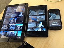
Responsive web design (RWD) is an approach to web design that makes web pages render well on a variety of devices and window or screen sizes. Recent work also considers the viewer proximity as part of the viewing context as an extension for RWD.[1] Content, design and performance are necessary across all devices to ensure usability and satisfaction.[2][3][4][5]
A site designed with RWD[2][6] adapts the layout to the viewing environment by using fluid, proportion-based grids,[7][8] flexible images,[9][10][11] and CSS3 media queries,[4][12][13] an extension of the @media rule, in the following ways:[14]
- The fluid grid concept calls for page element sizing to be in relative units like percentages, rather than absolute units like pixels or points.[8]
- Flexible images are also sized in relative units, so as to prevent them from displaying outside their containing element.[9]
- Media queries allow the page to use different CSS style rules based on characteristics of the device the site is being displayed on, most commonly the width of the browser.
Responsive web design has become more important as the amount of mobile traffic now accounts for more than half of total internet traffic.[15] Therefore, Google announced Mobilegeddon in 2015, and started to boost the ratings of sites that are mobile friendly if the search was made from a mobile device.[16] Responsive web design is an example of user interface plasticity.[17]
Related concepts[edit]
Mobile first, unobtrusive JavaScript, and progressive enhancement[edit]
"Mobile first", unobtrusive JavaScript, and progressive enhancement are related concepts that predate RWD.[18] Browsers of basic mobile phones do not understand JavaScript or media queries, so a recommended practice is to create a basic web site and enhance it for smart phones and PCs, rather than rely on graceful degradation to make a complex, image-heavy site work on mobile phones.[19][20][21][22]
Progressive enhancement based on browser, device, or feature detection[edit]
Due to the high volume of usage of internet on mobile devices they can no longer be ignored. In 2014, for the first time more users accessed the internet from their mobile devices than desktop.[23] Where a web site must support basic mobile devices that lack JavaScript, browser ("user agent") detection (also called "browser sniffing") and mobile device detection[20][24] are two ways of deducing if certain HTML and CSS features are supported (as a basis for progressive enhancement)—however, these methods are not completely reliable unless used in conjunction with a device capabilities database.
For more capable mobile phones and PCs, JavaScript frameworks like Modernizr, jQuery, and jQuery Mobile that can directly test browser support for HTML/CSS features (or identify the device or user agent) are popular. Polyfills can be used to add support for features—e.g. to support media queries (required for RWD), and enhance HTML5 support, on Internet Explorer. Feature detection also might not be completely reliable; some may report that a feature is available, when it is either missing or so poorly implemented that it is effectively nonfunctional.[25][26]
Challenges, and other approaches[edit]
Luke Wroblewski has summarized some of the RWD and mobile design challenges, and created a catalog of multi-device layout patterns.[27][28][29] He suggests that, compared with a simple RWD approach, device experience or RESS (responsive web design with server-side components) approaches can provide a user experience that is better optimized for mobile devices.[30][31][32] Server-side "dynamic CSS" implementation of stylesheet languages like Sass or Incentivated's MML can be part of such an approach by accessing a server based API which handles the device (typically mobile handset) differences in conjunction with a device capabilities database in order to improve usability.[33] RESS is more expensive to develop, requiring more than just client-side logic, and so tends to be reserved for organizations with larger budgets. Google recommends responsive design for smartphone websites over other approaches.[34]
Although many publishers are starting to implement responsive designs, one ongoing challenge for RWD is that some banner advertisements and videos are not fluid.[35] However, search advertising and (banner) display advertising support specific device platform targeting and different advertisement size formats for desktop, smartphone, and basic mobile devices. Different landing page URLs can be used for different platforms,[36] or Ajax can be used to display different advertisement variants on a page.[24][28][37] CSS tables permit hybrid fixed+fluid layouts.[38]
There are now many ways of validating and testing RWD designs,[39] ranging from mobile site validators and mobile emulators [40] to simultaneous testing tools like Adobe Edge Inspect.[41] The Chrome, Firefox and Safari browsers and the Chrome console offer responsive design viewport resizing tools, as do third parties.[42][43]
Use cases of RWD will now expand further with increased mobile usage; according to Statista, organic search engine visits in the US coming from mobile devices has hit 51% and are increasing.[44]
History[edit]
The first site to feature a layout that adapts to browser viewport width was Audi.com launched in late 2001,[45] created by a team at razorfish consisting of Jürgen Spangl and Jim Kalbach (information architecture), Ken Olling (design), and Jan Hoffmann (interface development). Limited browser capabilities meant that for Internet Explorer, the layout could adapt dynamically in the browser whereas for Netscape, the page had to be reloaded from the server when resized.
Cameron Adams created a demonstration in 2004 that is still online.[46] By 2008, a number of related terms such as "flexible", "liquid",[47] "fluid", and "elastic" were being used to describe layouts. CSS3 media queries were almost ready for prime time in late 2008/early 2009.[48] Ethan Marcotte coined the term responsive web design[49] (RWD)—and defined it to mean fluid grid/ flexible images/ media queries—in a May 2010 article in A List Apart.[2] He described the theory and practice of responsive web design in his brief 2011 book titled Responsive Web Design. Responsive design was listed as #2 in Top Web Design Trends for 2012 by .net magazine after progressive enhancement at #1.
Mashable called 2013 the Year of Responsive Web Design.[50] Many other sources have recommended responsive design as a cost-effective alternative to mobile applications due to its ability to house all of the code in a single website. Users and developers alike began realizing the benefits and importance of mobile-responsive designs as mobile use continued to rise. [51] This realization of importance was confirmed when Google made their announcement that search engines were going to reward responsive websites with increased rankings.
See also[edit]
- Adaptive web design
- CSS framework
- Em (typography) § CSS
- Progressive enhancement
- Tableless web design
References[edit]
- ^ Tafreshi, Amir E. Sarabadani; Marbach, Kim; Norrie, Moira C. (5 June 2017). Proximity-Based Adaptation of Web Content on Public Displays. International Conference on Web Engineering (ICWE):Web Engineering. Lecture Notes in Computer Science. 10360. pp. 282–301. doi:10.1007/978-3-319-60131-1_16. ISBN 978-3-319-60130-4.
- ^ a b c Marcotte, Ethan (May 25, 2010). "Responsive Web design". A List Apart.
- ^ "Ethan Marcotte's 20 favourite responsive sites". .net magazine. October 11, 2011.
- ^ a b Gillenwater, Zoe Mickley (December 15, 2010). Examples of flexible layouts with CSS3 media queries. Stunning CSS3. p. 320. ISBN 978-0-321-722133.
- ^ Schade, Amy (2014-05-04). "Responsive Web Design (RWD) and User Experience". Nielsen Norman Group. Retrieved 2017-10-19.
- ^ Pettit, Nick (August 8, 2012). "Beginner's Guide to Responsive Web Design". TeamTreehouse.com blog.
- ^ "Core concepts of Responsive Web design". September 8, 2014.
- ^ a b Marcotte, Ethan (March 3, 2009). "Fluid Grids". A List Apart.
- ^ a b Marcotte, Ethan (June 7, 2011). "Fluid images". A List Apart.
- ^ Hannemann, Anselm (September 7, 2012). "The road to responsive images". net Magazine.
- ^ Jacobs, Denise (April 24, 2012). "50 fantastic tools for responsive web design". .net Magazine.
- ^ Gillenwater, Zoe Mickley (October 21, 2011). "Crafting quality media queries".
- ^ "Responsive design—harnessing the power of media queries". Google Webmaster Central. April 30, 2012.
- ^ W3C @media rule
- ^ "Cisco Visual Networking Index: Global Mobile Data Traffic Forecast Update 2014–2019 White Paper". Cisco. January 30, 2015. Retrieved August 4, 2015.
- ^ "Official Google Webmaster Central Blog: Rolling out the mobile-friendly update". Official Google Webmaster Central Blog. Retrieved August 4, 2015.
- ^ Thevenin, D.; Coutaz, J. (2002). "Plasticity of User Interfaces: Framework and Research Agenda". Proc. Interact'99, A. Sasse & C. Johnson Eds, IFIP IOS Press. Edinburgh. pp. 110–117.
- ^ "What is Responsive Web Design". July 23, 2012.
- ^ Wroblewski, Luke (November 3, 2009). "Mobile First".
- ^ a b Firtman, Maximiliano (July 30, 2011). Programming the Mobile Web. p. 512. ISBN 978-0-596-80778-8.
- ^ "Graceful degradation versus progressive enhancement". February 3, 2009. Archived from the original on November 13, 2014.
- ^ Designing with Progressive Enhancement. February 2010. p. 456. ISBN 978-0-321-65888-3. Retrieved March 1, 2010.
- ^ "Mobile Websites | All The Way Up Media". All The Way Up Media. 2016-10-31. Retrieved 2017-10-08.
- ^ a b "Server-Side Device Detection: History, Benefits And How-To". Smashing magazine. September 24, 2012.
- ^ "BlackBerry Torch: The HTML5 Developer Scorecard | Blog". Sencha. August 18, 2010. Archived from the original on 2014-03-05. Retrieved September 11, 2012.
- ^ "Motorola Xoom: The HTML5 Developer Scorecard | Blog". Sencha. February 24, 2011. Archived from the original on 2015-02-13. Retrieved September 11, 2012.
- ^ Wroblewski, Luke (May 17, 2011). "Mobilism: jQuery Mobile".
- ^ a b Wroblewski, Luke (February 6, 2012). "Rolling Up Our Responsive Sleeves".
- ^ Wroblewski, Luke (March 14, 2012). "Multi-Device Layout Patterns".
- ^ Wroblewski, Luke (February 29, 2012). "Responsive Design ... or RESS".
- ^ Wroblewski, Luke (September 12, 2011). "RESS: Responsive Design + Server Side Components".
- ^ Andersen, Anders (May 9, 2012). "Getting Started with RESS".
- ^ "Responsive but not completely mobile optimised | Blog". Incentivated.
- ^ "Building Smartphone-Optimized Websites".
- ^ Snyder, Matthew; Koren, Etai (April 30, 2012). "The state of responsive advertising: the publishers' perspective". .net Magazine.
- ^ "Google Partners Help". google.com. Retrieved May 21, 2015.
- ^ JavaScript and Responsive Web Design Google Developers
- ^ "The Role of Table Layouts in Responsive Web Design". Web Design Tuts+. Retrieved May 21, 2015.
- ^ Young, James (August 13, 2012). "Top responsive web design problems... testing". .net Magazine.
- ^ "Best mobile emulators and RWD testing tools". Best Mobile Emulators. March 20, 2018.
- ^ Rinaldi, Brian (September 26, 2012). "Browser testing... with Adobe Edge Inspect".
- ^ "Responsive Design View". Mozilla Developer Network. Retrieved May 21, 2015.
- ^ Malte Wassermann. "Responsive design testing tool – Viewport Resizer – Emulate various screen resolutions - Best developer device testing toolbar". maltewassermann.com. Retrieved May 21, 2015.
- ^ "Mobile share of organic search engine visits in the United States from 3rd quarter 2013 to 4th quarter 2016". Statista. Retrieved 27 March 2017.
- ^ Kalbach, Jim (July 22, 2012). "The First Responsive Design Website: Audi (circa 2002)."[self-published source?]
- ^ Adams, Cameron (September 21, 2004). "Resolution dependent layout: Varying layout according to browser width". The Man in Blue.
- ^ "G146: Using liquid layout". w3.org. Retrieved May 21, 2015.
- ^ "Media Queries". w3.org. Retrieved May 21, 2015.
- ^ "OutSeller Group - Organize, Optimize, Maximize". outseller.net. Retrieved May 21, 2015.
- ^ Cashmore, Pete (December 11, 2012). "Why 2013 Is the Year of Responsive Web Design".
- ^ Foster, Wes (December 6, 2016). "Why mobile websites are important".


